
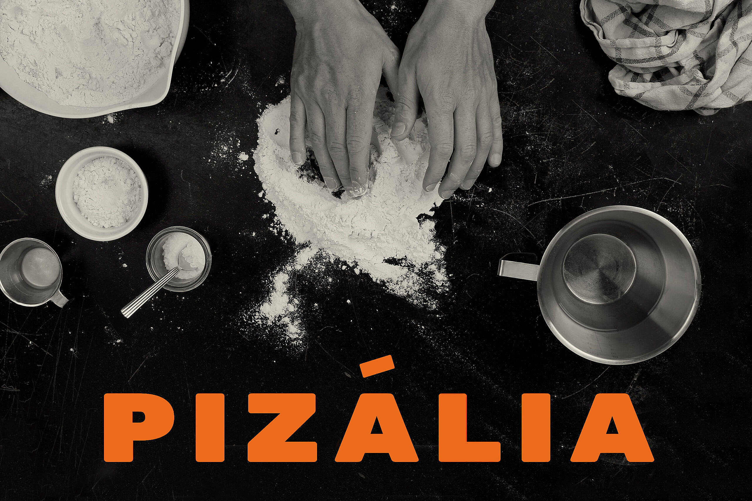
PIZÁLIA
Namning, visual identity and packaging design for a Danish white lable brand.
2021
PROJECT
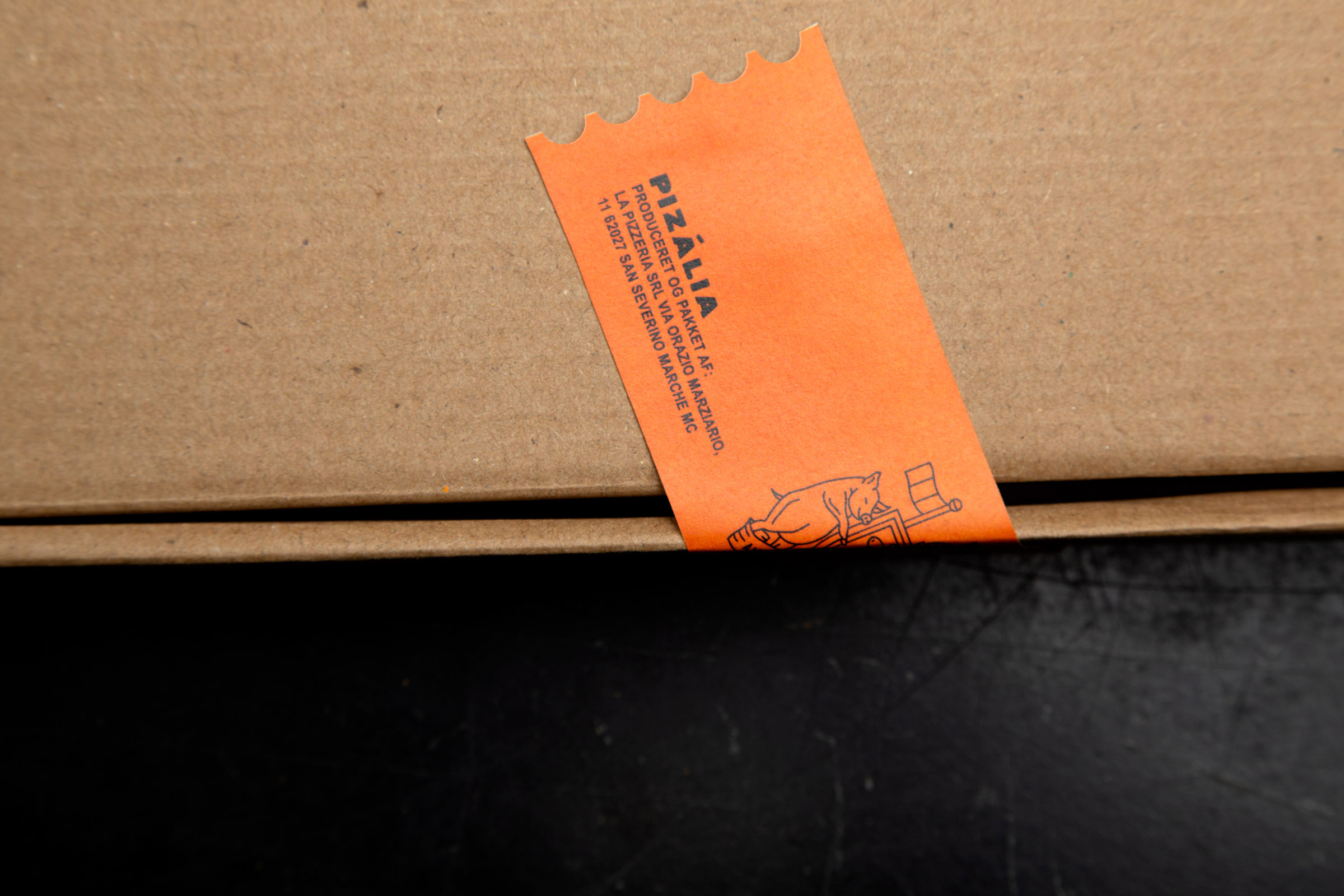
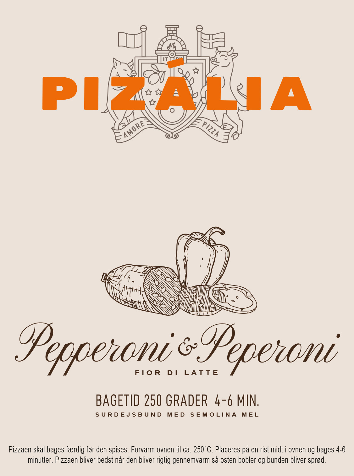
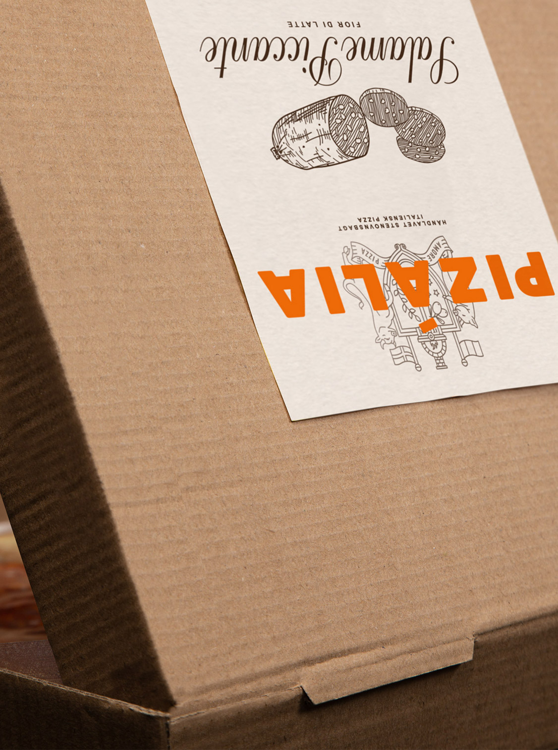
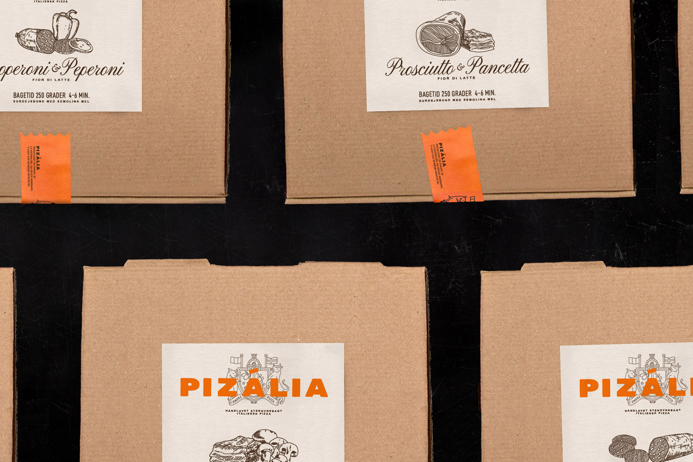
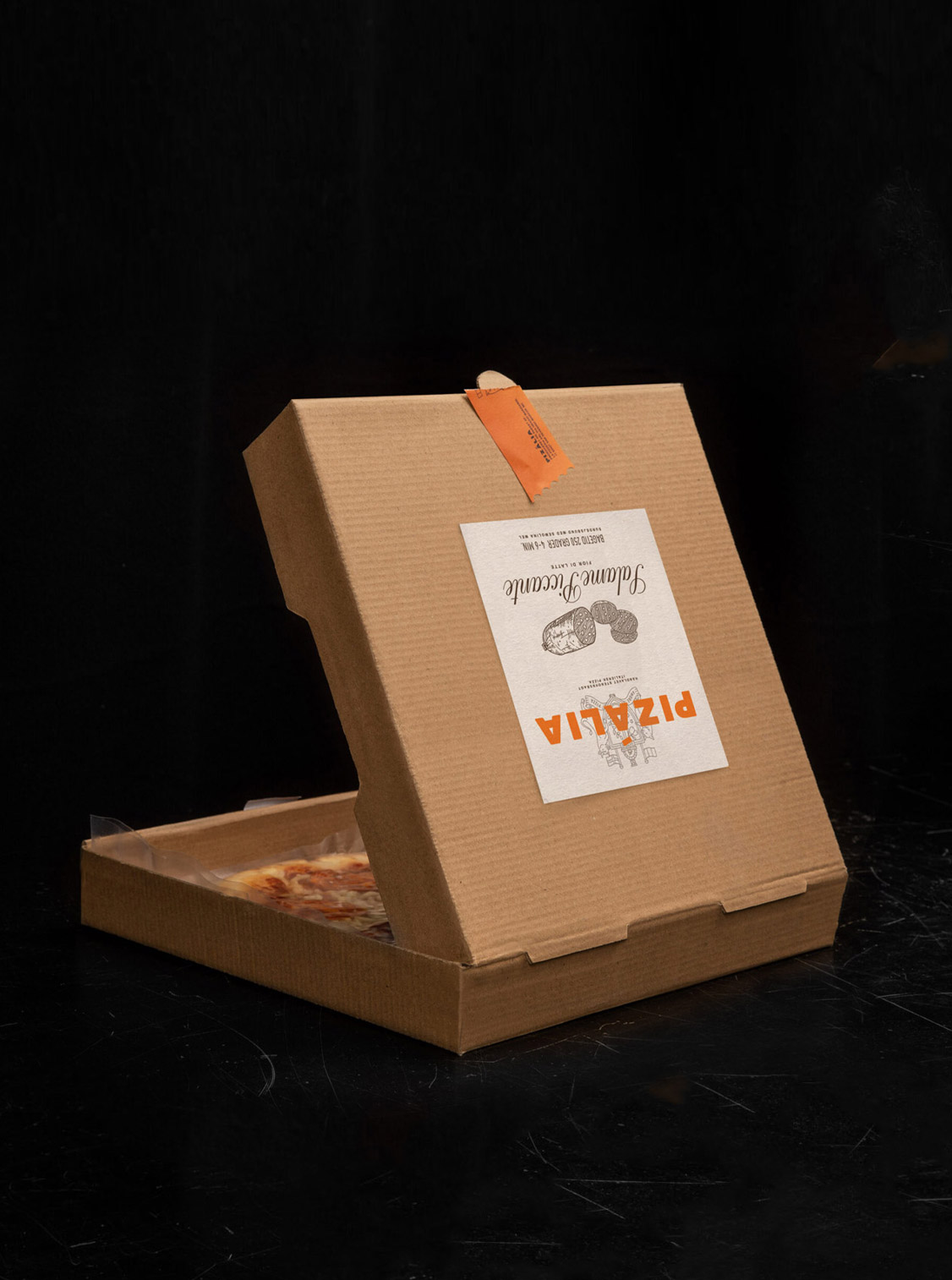
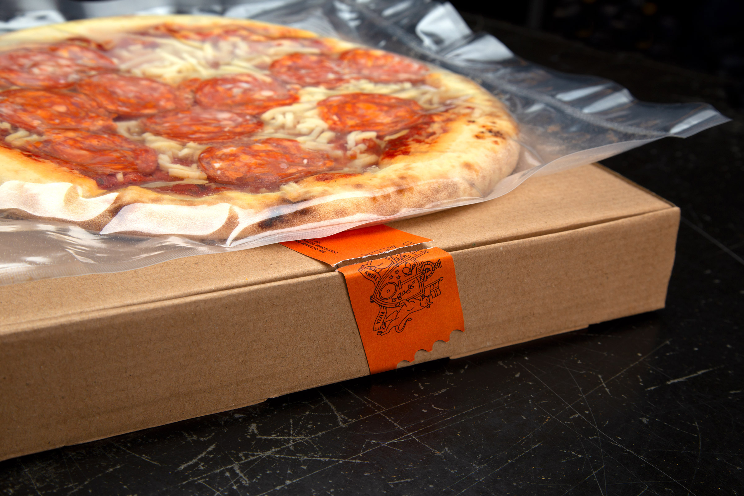
The brand name, PIZÀLIA, is a contraction of Pizza ⭤ Italia, to emphasize the product's heritage. In order to differentiate Pizália from the main competitors, I chose to draw the ingredients by hand and designed a brand which also complements the Italian touch which is an essential part of the brand.
— Brand identity
— Naming
— Packaging design
The brand name, PIZÀLIA, is a contraction of Pizza ⭤ Italia, to emphasize the product's heritage. In order to differentiate Pizália from the main competitors, I chose to draw the ingredients by hand and designed a brand which also complements the Italian touch which is an essential part of the brand.
PROJECT
The brand name, PIZÀLIA, is a contraction of Pizza ⭤ Italia, to emphasize the product's heritage. In order to differentiate Pizália from the main competitors, I chose to draw the ingredients by hand and designed a brand which also complements the Italian touch which is an essential part of the brand.
— Brand identity
— Naming
— Packaging design

© 2012—2025
©